UCI Campus Rec

UCI Campus Rec

By InnoSoft Canada Inc.

Score: 1.25
1.25
From 28 Ratings

Description

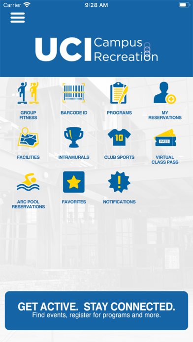
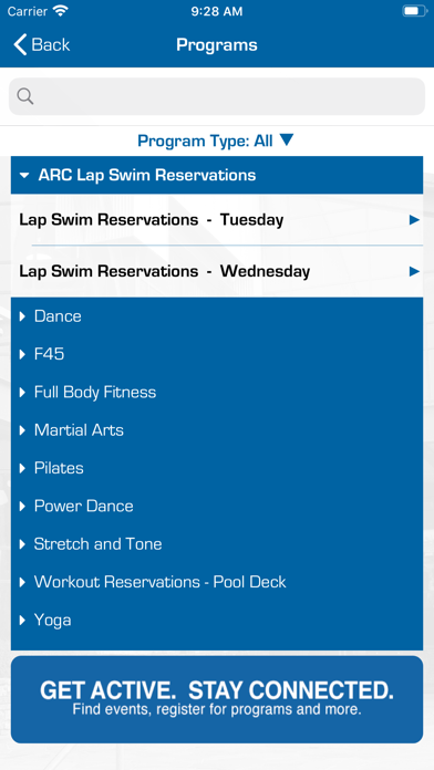
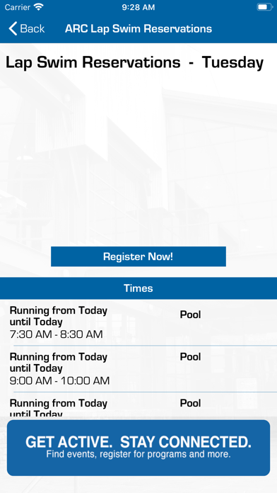
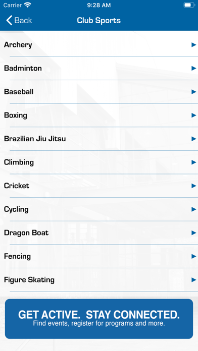
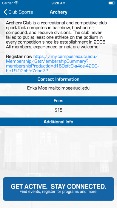
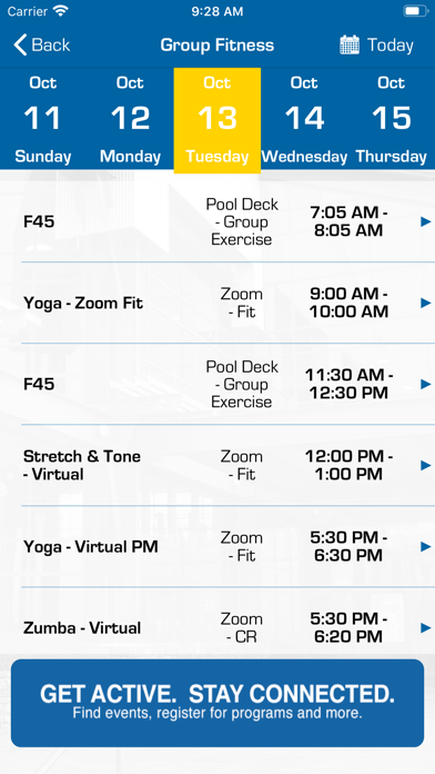
Official app for University of California, Irvine Campus Rec; includes A digital ID Card, Group Fitness listings, Intramural Sports, Club Sports and more! Stay up to date with UCI Campus Rec and Group Fitness by downloading our NEW mobile app and be sure to opt into push notifications so we can always keep you up to date! Get access to facility hours, events and programs offered through Campus Recreation.

Screenshots

Reviews

  • Need to log in every time

    1
    By Diejd
    Pls make some face id log in
  • Needs persistent login

    1
    By real_nate
    The app is very inconvenient to use day after day. At least have the login stay for a week instead of five minutes or less.
  • Inconvenient

    1
    By frazzledoften
    I have to open the app, log into my user acccount, send a push, approve the push and then go back to the app to be able to get in to the gym. This is a gym, this is not Fort Knox!
  • UCI Has a CS Department

    1
    By splch
    I'm sure any ICS student could do a better job developing this app with some Google searches than whatever company was sourced for this.
  • Unnecessary, Clunky, Stupid to use

    1
    By Gamer1235258935895170758
    A one time registration at the front desk was all that was needed before, and it worked ok. Who knew a stupid app would replace it and introduce more steps to a simple process. You get redirected several times after selecting one of the many icons and you have to put in your reservation through your student id... no password saving. All for 1 hour in a gym that has had all the free weights moved because the "novel sars-2 covid 19 coronavirus" (dont shorten the name of the virus - it's a really big deal)... maybe dumbells have covid boogers or something on them i dont know... No benches, 2 squat racks only and a basketball court full of weighted extension machines? Sad.
  • Fake html app

    1
    By john kazdan
    I can see the developer lied to his boss. It is even better to make reservation online.
  • A major inconvenience, a daily nuisance

    1
    By Joshua EP
    Much like many other reviews, the constant need for logging in is extremely inconvenient. Because we are allotted a single 1 hour reservation a day, we are extremely limited on time and should be making the most of it. Furthermore, because we are required to use the app instead of using our own IDs to scan for entrance we are FORCED to go through the constant log in (with DuoMobile also hurting the time constraint) and potentially waste precious time to be spent on working out and improving our personal fitness. Please fix this for all ARC patrons, if you are forcing us to use this app at least make it easier to use.
  • Really really, really really bad

    1
    By chrisfrog1234
    The app is hot garbage. I can’t remain logged in to the app bc I have to do dual mobile authentication EVERY TIME. I can’t even select the option to remember me for 24 hours, actually. The interface is horrible and unintuitive. The buttons are horribly placed and their descriptions are confusing to navigate. Literally any UCI CS student could’ve made a better app. Please fix this broken app immediately, especially if you’re demanding that students use it.
  • Poorly designed

    1
    By Kenneth Rhee
    This application reflects so badly on UCI administrators and whoever is in charge of the arc.I can’t possibly fathom or begin to think how or why they approve this application to be on the App Store. How does it make sense to login every time you have to access any of the buttons or pages? Why not just have the whole thing as a web application. They literally could’ve hired a student to make a better application. Instead, they probably wasted a fortune paying a company to make this app. I am disgusted by the waste of resources the ARC administrators probably put into this app and truly makes me wonder how mismanaged my tuition money is.
  • Frustrating

    1
    By oshoganstark
    Some notes: 1. It’s very frustrating having to re-login every time I select a button. 2. Buttons are labeled poorly and there are no logical ways to exit certain pages (see Barcode). 3. If it’s annoying, it isn’t accessible. I feel like a student from UCI’s UXUI program could have made something more user-friendly... just saying.

keyboard_arrow_up